Thursday, 24 January 2013
Wednesday, 23 January 2013
My digital landscape shots
I shot this photo using a tripod, aperture 22. shutter speed 1 second.
I edited this buy creating my own brush out of text, using multiple layers and blending modes. I applied a gradient overlay which gave me the colours for the overall photo, this is were the edit was spoiled as i prefer the realistic colours that relate to the subject also I think the detail in the landscapes adds to the image. The colours just make this look immature and I know I can do better so i am going to have another go at this edit.
Using the same text as the previous image but changing the font size and keeping it all in one colour looks so much more effective. I changed the blending mode to soft light for the text to blend in more subtle with the image. I definitely prefer this.
This is my favourite slow shutter speed shot. I exposed it for 1 second and the water seems so peaceful, the surroundings look silent and eery. It looks really ghostlike.
I photocopied rotated and re-photocopied the original print onto the same paper to create a multiple exposure without the use of photoshop. This was by far the simplest technique I have discovered to create a sandwich style print. It looks really mysterious and I would definitely consider using this technique again as it works well with landscapes especially as my original photo consists of the landscape and its reflection in the pond.

To further develop I Inverted the colours of the previous picture which makes it appear very magical and surreal. The colours are soft and peaceful.
Monday, 21 January 2013
Digital Experiments
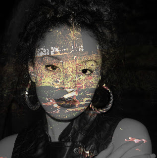
I like this but I do not think this is a strong enough image to present as a final piece. I want to do multiple exposures for my final piece but i think i should make them more detailed by adding layers of text or maybe adding an element of movement to them. I used a portrait that i took of my friend outside in the dark using flash as my source of light, the landscape you see as you look into her face is the exact point i stood to take the portrait of my friend.
This multiple exposure works better as the naked body form links with nature as they are both natural. I think this is still to simple to present as a final piece. I erased away some of the opacity of the background so you would focus more on the landscape through the body.
Darkroom Experiments
I added leaves to the photo to make it look like the leaves were coming out the top of the tree but i didn't find it effective. I thought
I collected dead leaves and things from the scenery were I shot my film which was in the woods. I really like these as they add a splash of colour to the black and which prints and frames them really nicely.
Subscribe to:
Comments (Atom)


