Wednesday, 4 July 2012
Norm Magnusson 'Decorated Nature'
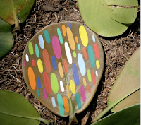
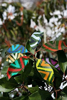
Norm Magnussun paints on pieces of nature by adding stripes, circles or virtually any type of pattern. The aim of his series is to explore the relationship mankind share with nature. He is from a quiet town near woodstock, New York and he uses his surroundings as his canvas.
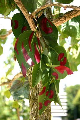
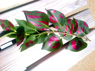
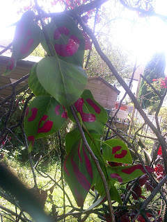 This is my try at decorating nature, i selected a piece of nature and painted a design on it using acrylic paints. I chose pink because it is bright and stands at well , i placed it in different places to photograph it. I think it looks best in the tree.
Jan Von Holleben inspired giant scene development and photography
Jan Von Holleben is the son of a child therapist which reflects in his work as he uses children to represent his childhood memories and concepts of playing. His work leaves me feeling nostalgic, it brings me back to my childhood, he creates big scenes then stands vertically above them to photograph so you feel like it is life size as the children are in proportion to the scene
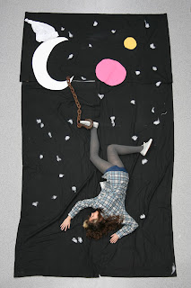
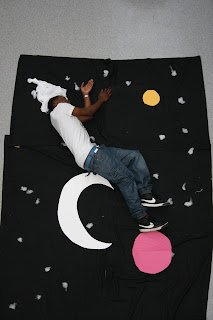
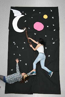 To create these giant scenes we put a large piece of black material down for the background, cut out a moon and some planets using coloured paper. I thought the rusty hook would make it more interesting so we used it to look as if the girls were hanging off the moon with it. We also used cotton wool to create the stars, i think our attempt was successful and with better resources we could produce some really good scenes.
Lin Osbourne inspired Digital Collage Adobe Photoshop Tutorial
Example of Lin Osbournes work
My attempt in the style of Lin Osbourne
Following up my chosen theme of landscapes i cropped photos I have taken which are centred around urban grafitti landscapes. I used the crop tool whilst holding down shift to achieve the square, I dragged each square into a blank document, arranged the images to my liking and adjusted them around until I thought the compositions worked well together. Using a grid and the 'snap to' option made the process much easier as it is a guideline which helps you place each photo more accurately.
Markus Kisson inspired pop-up photographs
Typography photograph adobe photoshop tutorial
The image used is one that I took at Grange Park in Thornton Heath, it was such a sunny day and i thought it was a lovely view. I think this experiment was successful but could of been improved with larger font.
Open image. Text ready in an open document. Split image into sections by going to colour range, select shadows & mid tones and paste into layers separately. Join the two separate layers together and then create a new square document for the text to go on. Copy and paste the text using a font of your choice, i used Edwardian script and a font size of 30. Turn the text into a brush by defining brush preset and naming it. You can then use it in your other document, select the brush u just made starting off with it quite small and making sure it's in black, use the stamp on different parts of the image. Make it bigger and smaller so the fonts are in different sizes. Create a layer mask, hide it, click layer 1, select all, copy, click on the layer mask, paste and then deselect. Invert your image, create a new layer underneath the text layer with a white background. Edit the text layer by going into layer blending options, open up the gradient box, click on screen for the blending mode and select a coloured gradient. Change the scale of it and angles to suit yourself. Click ok. Choose a black brush size 30, opacity 40 and paint over the image which helps to get rid of some of the excess white, helps to pick out some of the key areas which are less obvious. Your typography style image should be complete.
Digital Photos inspired by my research
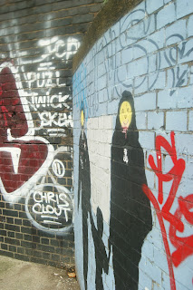
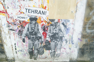
these pictures take a look at the more urban side of landscape, there is lots of street art around but some would argue that it is grafitti.
Subscribe to:
Comments (Atom)


