Wednesday, 10 October 2012

In depth review of experimental work so far


In the AS-A2 project we explored different artists and there style of working. I learned a lot during that time , you can present an image in a variety of different ways such as cutting into it and popping it up in the style of Markus Kisson. This was a simple way of bringing your photo to life but the subject matter u decide to cut influences the end result of the image.

I was taken by an artist called Curtis Mann who bleaches coloured photographs using various techniques such as dipping the entire print into bleach then rinsing it under water, you see the image transform before your eyes as parts of it wash away and you are left with a surreal image with the effects of the bleach reminding you of fire and heat. I experimented in this style by bleaching prints but I first painted clear nail varnish over parts of the image i wanted to save & left it to dry. I then emerged the whole image into the bleach and the parts i hand covered with nail varnish remained whilst the rest dissolved off of the paper. I also dipped a cotton bud in bleach and used it to work into the image this gave me more control over my enhancement of the image. I really enjoyed this process and thought i would use it towards my final piece.

I experimented with pinning holes through images taking inspiration from Amy Friend and this is definitely a pathway I am going to go down to enhance my final piece. I found them so dreamlike and magical, not all of her images are her own some she bought or found but I really like a photo in particular which seemed to have been taken from a low angle. Definitely something i would consider using in my work.

Digital Manipulation on photoshop was one of my favourite experiments as you are not very limited as to what you can do, if you make a mistake you can undo it without having to start again from scratch. It is a very convenient way of working. I really liked how i was able to develop my own style from gaining inspiration from various tutorials and tweaking then to create my own way of working that i felt was suitable for my images.

Toning prints I experimented with using darkroom prints and food dye and also digital images and photoshop. I preferred the use of photoshop as I could easily change the opacity to suit my liking and also it wasn't such a messy job, when using the food dye it was sticky, dust dryer onto the food dye and left the darkroom prints looking messy which I did not like.

Handmade negatives wash an interesting angle to create prints from but I feel that it wouldn't go well with my theme unless i sandwich printed my handmade negative with a camera negative to create a something really interesting and different. I used sugar washing up liquid and food dye to create mine and i was surprised at how good they looked. Once putting the concoction into the negative carrier and enlarging it it reminded me of crystals and diamonds the sugar looked very nice.


Vignetting, Highlighting areas of Interest, Press Printing, Dodging

Original Print - Aperture 8, Exp. 5 Seconds

Vignetting
To vignette in the darkroom i simply cut out an oval shape in some paper and held it above the photographic paper, holding it still it gave a harsh edge to the oval shape. On my second attempt I moved the vignetting card around slowly and slightly to produce a soft edge which turned out to be my favourite. Using different shapes to create a vignette could be interesting, especially if they related to my work e.g. I could cut out londons horizon or something more simple like a cluster of trees which could make the photo more unusual and creative.

Original Print
For this print I used a dodging tool which I created using a piece of wire with black card taped to the end. I needed to dodge part of my photo to reduce the exposure time as the plant on the wall was coming up to dark, to create the desired effect throughout the exposure I slowly kept the dodge tool moving so the lighter part of the image was not a sudden effect which makes it look more realistic. 

Highlighting areas of interest
I exposed the paper for 3 seconds, put the coins on then exposed it for a further 4 seconds. I am not keen on this experiment, i like how key parts of the image show extra detail because they were exposed for a shorter time so the fact that i reigned in on the brickwork is more interesting but it isn't an experiment i enjoyed.

Press Printing
Using objects that relate to landscapes for press printing, I decided to use a brick as I have photographed a lot of urban landscapes so i decided it would be a good object to experiment with. I enjoyed press printing as you can decided more or less which part of your photo gets developed and it gives it an element of mystery as your left wandering what is missing. I would improve by using different methods of applying the developer.


Friday, 5 October 2012

Handmade negatives

A handmade negative is a negative made without the use of a camera. This could be drawing on tracing paper or acetate, also placing objects on photographic paper and exposing it to light which creates a photogram.


I used cellophane to act as the negative for my handmade negative, i then put washing up liquid sugar and blue food dye on top which made a beautiful pattern when i exposed it for 5 seconds on an aperture of 8. I experimented further by placing objects on top of the photographic paper but i think it would of been better if i cut out a stencil of a landscape/ some buildings. This was a good experience and i could also overlay the handmade negatives with normal negatives to create some really interesting prints.


Sunday, 30 September 2012

Digitial Manipulation

Before
After
Photoshop HDR effect - Tutorial Link
I used adobe photoshop to manipulate my original photo to gain the High Dynamic Range effect. I adjusted elements of the photo such as the highlights and shadows which bring out extra detail, midtone contrast is a setting that contributes very much to the overall style of the photo so I raised it up to about +50. I heightened the radius of the image to give it a more blurry effect. I also added a desaturation layer and then changed the blending mode of the layer to overlay, changing the blending mode helped add saturation to the photo. The colour balance tool comes in handy to add warmth to the image and give it more vibrancy. I really like the effect created but think to improve it I should photograph  landscapes with more form and structure, using the rule of thirds in my pictures would definitely improve the outcome further. 


Before
After
The ultimate lomo effect - Tutorial Link

I raised the temperatures to give the image a warmer feel then duplicated the layer incase i made any mistakes. I feathered the lasso tool at 250pixels to give the selection a softer edge.  Using adjustments layers is one of many ways to manipulate the levels and curves which give the selected area the vignette effect by deepening the shadows. I then cross processed the red, blue and green curves by adjusting them to my liking, i brought the blue up to give the weather more depth and contrast, i also increased the red give the sea front more life. As the layers i was working with were building up i merged the layer to make it clearer and so i wouldn't loose any of my adjustments. I brought down the saturation and made a new layer then painted it grey, i added grain to the layer then changed the blending mode to overlay then adjusted the opacity of it to make it have a more realistic effect. I also blurred the edges of the photo to bring more focus to the centre as the land is the focal point. The lomography effect is my favourite because I find it visually pleasing, it also works really well with my theme and it gives the photos a vintage effect that is not very common with the wide range of digital photography available. I could improve by doing a series of landscapes with a running theme of buildings which makes it more urban. 

Before
After
Instagram Nashville Effect - Tutorial Link

I do not like how this worked out, it could definitely be improved by further adjusting the levels, giving it more contrast and heightening the saturation. I duplicated the layer incase of any mistakes then i used a beige colour and filled a new layer and changed the blending mode to multiply. I then adjusted the curves but i think this is were i made the mistake of using to much green in the curve, it took away too much vibrancy from the image, i should of raised the red curve higher to give the image more balance as this looks quite flat. Using a better image with more light and subject would definitely improve this.


Vignette Effect Tutorial

Using the elliptical marquee tool i created an oval then i inversed the selection and filled it with black. I then used the filter option and used the gaussian blur to blur the edge giving it a softer look. I could have improved this by brightening the photo and raising the contrast as in the process of adding a vignette it has masked the original photo and made it more dim, also because I made the selection freehand the vignette is not even so next time I will use a grid. I do like the effect, i could next time experiment further by creating the vignette in various colours.

Friday, 28 September 2012

Solarisation Experiments


To digitally solarize my images i used adobe Photoshop. Although Man Rays solarized images were done in the darkroom our outcomes both share similar qualities. Man rays work reminds me of x-rays and his subject matter contributes to that, the effect produces a glow that you don't get when your image is in standard black and white. 
To created the desired effect using Photoshop i selected an image i took this week down in Brighton relating to my them landscapes. I converted it to black and white by going to layer > new adjustment layer >black and white > OK. I then created a curve layer by going to layer > new adjustment layer > curves > OK. I then invert the image by using the pencil tool in the curves layer box, holding down the shift key while the output is on zero I create an inverted v and let go which completes the first step.
I then need to create a new curve layer by going to layer > new adjustment layer > curves > OK. Manipulate the curve using the squiggly line tool which allows you to edit points to modify the curve effects to your liking. A small movement of the line makes a noticeable difference so you don't need to get carried away. I then have the option to use the dodge tool to lighten and the burn tool to darken parts of my image. I use the dodge tool to give the clouds in my first photograph more tone. I first have to create a new layer and then apply the image which duplicates everything I've done up to this point into a new layer. I can then adjust the size and hardness of my tools and I play around and decide on 50% hardness and 100% diameter for the dodge tool as it isn't to hard for my image it lightens it but leaves it looking realistic. 
I'm am really pleased with the turnout of both my images, they both look pleasing to the eye and I enjoyed making it as the process wasn't to lengthy. I would improve further by using a photo with more form next time.


I solarised these photos in the darkroom, I prefer the turnout of the digital solarisation experiment but this turned out well as well. The first print is definitely better because of the contrast of the grey and black. At first they were not printing well, i had the aperture on f8 and the exposure was 9 seconds, once i had put them into the developer and the image started appearing it looked fine but once i had taken it out and exposed it to the light for 1 second on f2.8 the images didn't appear to have much depth so to troubleshoot this problem i had to readjust the settings to f4 which worked. 


Monday, 24 September 2012

3x in depth analysis

Amy Friend
Amy Friend created this piece of work using some photos that are personal to her from family albums and others that she bought online from anonymous persons. She grew up in Canada, Ontario. The photo is from a series called Dare alla Luce. I have decided to analyse this enhanced photograph as landscapes is my chosen theme and i think it relates well. The work was exhibited at Sean O'Sullivan Gallery. I chose to analyse this piece of work because i have found it really inspiring and i definitely want to use this technique in my photos as i find it really beautiful. 

This is a link to amy friends website http://amyfriend.ca/section/282356_Dar_alla_Luc.html 
I believe the main theme of the photos is portraits but they contain a wide variety of landscapes, i can tell just by looking at the series, The title doesn't inform u directly because it is in a different language, but once translated from italian it means "to give birth". This is what the artist describes she was doing with her work as she gave birth to light through her photos by pinning holes through them. 
She talks about how the series came about and says light is what makes a photograph possible hence why she done these clever interventions with her photos.

She used photos either found or taken, pinned holes through the relevant parts with a small pin and then held it up to a light for the desired effect. The majority of her photos from this series are contrasting she pins the holes cleverly against the darker shades but with a few of them she does this with the lighter colours such as white and cream. It works well, it gives the images a small glow, in a way it reminds me of snowflakes because of the use of colours.
It is quite a personal project as she uses some images from her own family photo albums but on the other hand she did purchase pictures from out of her family. The tone and colour is key in this work as it is a black and white photo and the use of light shining through adds great contrast and brings more colour into the photo.

I chose to look as this photo as it really caught my eye, it reminds me of a photo i took for my as-a2 coursework and i thought her technique of using deliberate interventions works so well i wanted to try it. All the little lights remind me of loads of tiny fireflies, i think its really breathtaking. I haven't seen anything similar and i love the fact that its so simple but unique. 


Leslie David
Leslie David is a Paris based graphic designer, art director and illustrator from Montelimar now called Nougat in France. She studied there until the end of high school, she was always certain that she wanted to study in a creative field. She applied to go to art school in Lyon called Ecole des Beaux Arts, she soon found that it wasn't her cup of tea and she wanted to study a more applied type of art which lead her too take entrance examinations for a different school of arts, she passed and got into Strasbourg uni where she studied graphic design for four years. Souvenirs de Paris is the name of the work, it is a painting on a photograph and has been designed to sell as a postcard for colette an online store. I have decided this would be a good piece to analyse as the landscape theme of her photos taken in the 1940s along with the blend of paints makes it much more hands on, i like painting and the colours she uses compliment each other really well. I like the thickness of the paint it is brilliant how she only works into part of the photo with the paints, i thought it was odd at first but after looking at the series i think it works really well. 

I looked at an interview held by Lea Munsch from international interview magazine Freunde von Freunden. I learned that she "doesn't claim a concept associated with her creations", this i find understandable as i don't believe you always need a concept to create a successful piece of work. I would definitely relate her work with Landscape, the title of it translates to memories of paris which means the work is about the city. Seeing as the work will be sold as a postcard i take it the photos in the picture are areas that she has visited and she holds memories of the places. 

The use of acrylic paints and black and white photos is highly contrasting, i think she used a screen to press the paints across the images, her hands is also a possibility to create extra texture with the paints. She uses bright colours that compliment each other really well, the work is small and i think this works really well, if it was done on a large scale i don't think i would like it as much. The splashes of colour would be to much i think it is cute as a postcard. Colour, line and tone are the main formal elements used by Leslie , the line in the architecture and the tone from the shadows such as under the bridge adds more depth to the image.

I looked at this photo as the use of colour grabbed my attention, I thought to myself what does that mean? why has she used those colours? I like everything about the image because it is a new turn on an old image, its breaths new life into an old photo, Nina Chakrabati does a similar style of work were she paints patterns on images of peoples faces but she doesn't use a variety of colours like Leslie David. The detail she puts into the patterns are so precise and neat that it makes the final piece really excellent. This work has inspired me to think out of the box and that to create a photographic experiment i do not always have to used a picture that i took i could use something from the past.


Florian Imgrund

Florian Imgrunds work pulled me in because he creates these beautiful multiple exposures using only a camera, i first thought he made them using photoshop but further research revealed the extent of his skill after only having a film camera for 2years. He originates from Germany and is currently writing his doctoral thesis meanwhile working as an assistant professor. 

"I don't think i've been this impressed with double exposure work since first discovering Dan Mountford" This quote was on colossal and i think it is very fitting, i have also looked at Dan Mountfords work which is very similar and i think he is really talented too, i do favour Florians images though, they seem so effortlessly amazing.  Florians work consists of Landscape and human subject, the images are so delicate but the exposures together create such a powerful and breath taking scene i am just in love with them. I think the theme of this work is the connection between the earth and humans, i think its clever how he presents the world inside a human which in theory couldn't happen but it looks so good, the image is quite surreal and i thnk the main subject of the photo is the landscape because the girl is just looking down, i am not drawn to look at her i see through her in a way because she seems timid and not interesting to look at. 

He develops the images himself and uses the darkroom and his camera. The multiple exposures are created with the use of a multiple winding camera.  The work is untitled but i think this is fine as he wants you to focus on the images more then the title itself.  Tone and texture is vital in this photo as it gives it more depth and makes it a much stronger image, i love that it is in black and white, this gives it a more delicate and treasurable feel. I have created my own multiple exposure before using photoshop but this has definitely pushed me in the direction of wanting to try and create a multiple exposure using my camera. 


Friday, 7 September 2012

The enhanced image project

I will be learning a range of different techniques in the darkroom such as vignetting, toning prints and bleaching prints. I will be exploring and enhancing images using new methods and also old ones such as photoshop. I will be sticking to my chosen them which is landscapes and experimenting with my work with inspiration from other artists/ photographers so i can narrow down what i do and don't like in preparation for my final piece.

I underlined in red the artists and information that is significant to me. 

7

6

5

Rebecca Chew

3D Photos

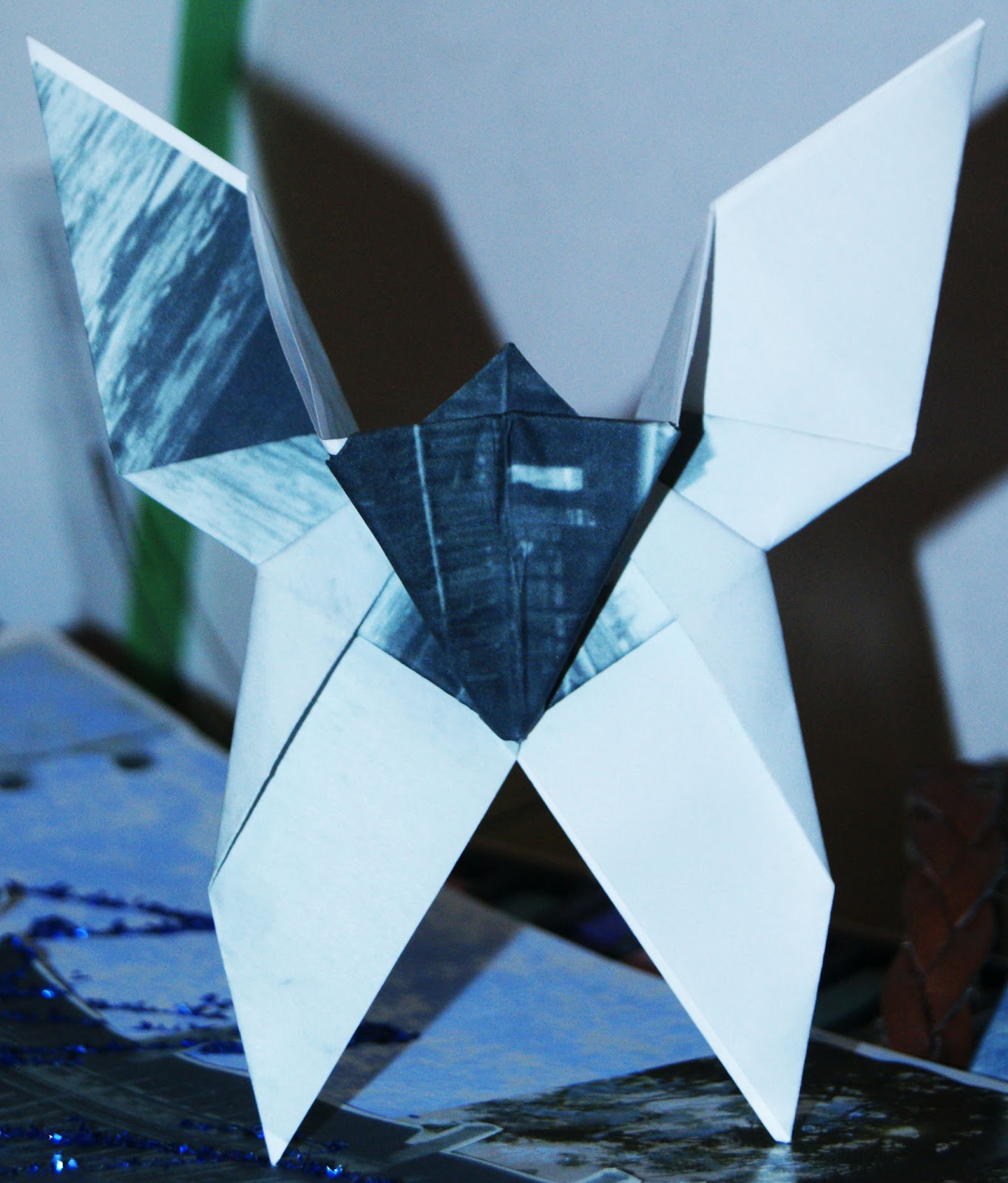
My origami butterfly, i am really pleased with how it turned out. It wasn't something i enjoyed doing but the end result looks good. 

William Hatch Crosby


Michelle Thompson inspired photo collage


Stephen J Shanabrook


Squashing, Folding, Flattening

Wednesday, 5 September 2012

Greg Sand photograph weaving.

I don't like this style of work but i'm glad i tryed it so i no that i wouldn't want to do it again. It reminds me of an optical illusion, i don't think it looks good. Maybe i could of used a better photo to try this with but i still don't think i would change my opinion on this style of work.


Amy Friend inspired photos


This artist pins holes through her photos and holds them up to light so the light shines throught the holes. I took photos of urban landscapes as that is my chosen theme and i used the same technique. I tryed to place the holes in more realistic places and i think i pulled it off quite well the photo looks pretty. I took the pictures on my dslr but i done it in black and white to give the work the same old fashioned feel as the artist Amy friends work.

Wednesday, 4 July 2012

Abigail Reynolds Paper Cutting Photographs

Jamie Beck inspired Animated Gif

Geraldine Georges Collage and Illustration - Handmade and Photoshop Tutorial


Norm Magnusson 'Decorated Nature'


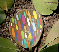
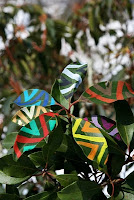
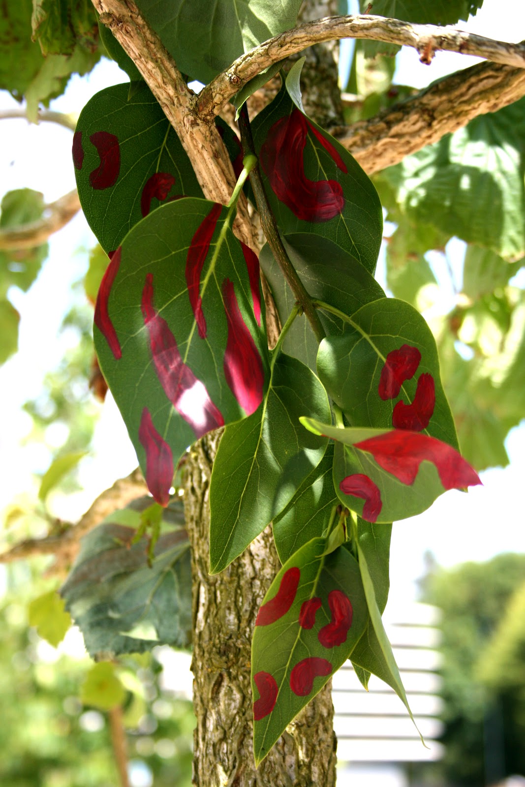
Norm Magnussun paints on pieces of nature by adding stripes, circles or virtually any type of pattern. The aim of his series is to explore the relationship mankind share with nature. He is from a quiet  town near woodstock, New York and he uses his surroundings as his canvas.


 This is my try at decorating nature, i selected a piece of nature and painted a design on it using acrylic paints. I chose pink because it is bright and stands at well , i placed it in different places to photograph it. I think it looks best in the tree.

Jan Von Holleben inspired giant scene development and photography


Jan Von Holleben is the son of a child therapist which reflects in his work as he uses children to represent his childhood memories and concepts of playing. His work leaves me feeling nostalgic, it brings me back to my childhood, he creates big scenes then stands vertically above them to photograph so you feel like it is life size as the children are in proportion to the scene
 To create these giant scenes we put a large piece of black material down for the background, cut out a moon and some planets using coloured paper. I thought the rusty hook would make it more interesting so we used it to look as if the girls were hanging off the moon with it. We also used cotton wool to create the stars, i think our attempt was successful and with better resources we could produce some really good scenes.