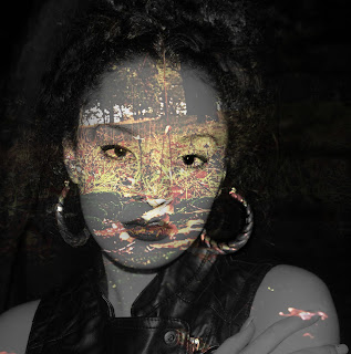
When I first started the exam project 'Inside Outside In between' I was interested at looking at still life, I found a photographer called Peter Lippmann who creates Still life's that have a glamorous touch to them incorporating objects such as food and Feminine objects like handbags and make up. I was inspired by this and decided to recreate it by using objects such as a cup of coffee, coffee beans, nail varnish and jewellery. I thought this was a strong starting point for still life as they were not so typical and looked very cool like they could be in a magazine. The represented females well and I think the images themselves were well lit and had quite good contrast. Some were not well in focus but for a first attempt I thought it was fine.
My first digital starting point was the everyday, I photographed my laundry before I washed it and at the end of the process I retrieved the dust from the Tumble dryer filter and photographed it. I got this idea by looking at an artist called Klaud Pichler, I found it refreshing to know that objects from the everyday that we simply overlook could be so great to photograph, the fact that I was involved with the process of creating the dust was also something that made me more intrigued by the outcome. I thought from this I would develop my ideas further by photographing more dust found in different places but then my ideas changed as I decided to ask strangers if I could photograph their belongings from either inside their bags or pockets. This related to the theme well as I took objects from inside someone's personal space and photographed them in a studio setting which is not very personal, it strips away the persons identity and gave the still lifes a sense of mystery leaving you questioning who the person was and what their life was like, why they had those items with them. I experimented with solarization and spot developing, I think the second experiment fit well with the idea because you couldn't see the photos clearly which gave them back a sense of privacy.
I also created some 3D photos using Photoshop, I photographed various people as I looked at many different artists that done portraiture and recognised this was something I really enjoyed. I combined this idea with inspiration from Brad Carlile as he photographed rooms and the colours in his photos inspired me to edit my portraits to make them look 3D.
I researched crime scene photography and decided I wanted to do my final piece on this subject, I found it so intriguing that i wanted to try and recreate my own crime scenes.
Overall I found the exam project difficult but i enjoyed j=some of the work I produced. I dont think i will be pleased with my final outcome when it is complete, I think i could of created something more unique.
Friday, 10 May 2013
Thursday, 9 May 2013
3D images - Anaglyph Effect
These photos are taken by Brad Carlile, They were all created by shooting a multiple exposure using a slide film with No use of photoshop. I attempted a multiple exposure but it did not come out well as the camera experienced shake throughout the process although i did use a tripod. I stuck this photos in my exam book but decided because i was still inspired by Brads photos I would attempt again on my digital camera. I am more intreested in photographing people then places so I transferred my interest of his work onto something I thought i would enjoy creating and photographed people in a studio with the use of studio lights so that I could have a clear background and edited the images so they would have a 3D effect. I found a tutorial on the internet that broke it down well and I picked up the process pretty fast.
I really enjoyed this tutorial it brings the photos more to life when you view them with 3D glasses but even without glasses they appear to have more dimensions and I feel like i can see movement/ depth in the images if I squint my eyes.

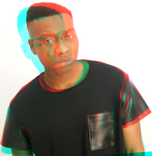
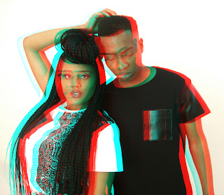
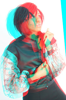
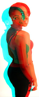
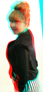
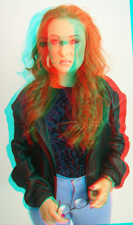
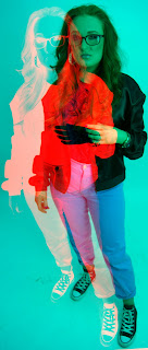
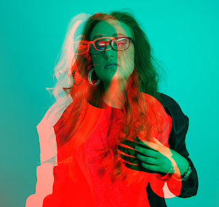 These are further experiments I created on photoshop by following a colour negative tutorial on youtube. I went on to experiment further because when I was finished editing all my photos and went back to my inspiration i noticed that his images were so colourful and vibrant that my edits seemed quite dull. These last two that made feel like more of a success because they are not natural colours and has clearly been manipulated in some way which i think relates it more to Brad Carlile.
Also the overlapping layers of each person in the photos makes it seem like their body is apart and you can see different layers and shades and shadows created by this. This experiment was a success in my eyes, I enjoyed doing it and would do it again, Next time i could try to include a room and maybe scan the photos in and add colour to the film photos on photoshop, or do it by hand using paints or tone the prints by using food dyes.
Wednesday, 1 May 2013
Dark room Prints
These are prints I done using 35mm Film. I solarized some of the prints by exposing them like normal then after putting them in the developer I exposed them under the enlarger light for 2.5 seconds. I then dispersed the image back into the stop and fix to complete the process. I spot developed some of the prints and i think this really suits the theme of my photos; I photographed objects from peoples bags around the college environment. The fact that these belongs are enclosed in peoples bags makes them private at times, They may include things that people may not want to be seen by others. The spot developing adds to this by only allowing you to see parts of the image and it makes you question why you can't see it all.
This print has a cloudy effect because when i was spot developing i used a paint brush that was soaked in washing up liquid which i did not realise until various attempts of re-printing. Once realising i found it quite interesting to rub the paintbrush over the whole print for an interesting affect.
Monday, 25 March 2013
The everyday photos
This is my 1st set of photos relating to the everyday. I photographed my laundry before i washed it. I then washed my clothes and tumble dryed them and collected the dust from the filter. I will also photograph the dust and use it for further experiments.
This is the dust I collected from the tumble dryer filter after I had done all my laundry. I set up a small lighted area using white foam board for a clear background and then in photoshop I increased the exposure a little.
These are my favourite photos from the series.
I then had the idea to create shapes using the dust. I think if i made a series of things that related to the dust it would be very interesting. e.g. making clothes out of the dust as that is were they originally came from.
Tuesday, 12 February 2013
Week 2
Why have you selected this starting point?
I have selected Personas as my starting point because it seems like an interesting challenge.
What are you planning to look at for Primary/ Secondary research?
Primary Research Is Lesbian Gay Bisexual Transexual community.
Which artists/designers will you be looking at?
Diane Arbus
Orlan
Inzajeano Latif
What materials/techniques would you like to experiment with?
Photoshop
Photomontage/ Joiner
Which experiment(s)are you planning to make?
I am planning to cut up some of the photos and piece them back together to show the fragile element of the persons confused gender as they probably don't tell everyone they cross dress and their pride could shatter if certain people found out.
Week 1
Why have you selected this starting point?
I have chosen this starting point as the everyday is everything around me. This will give me the chance to see things that I am always around in a different way.
What are you planning to look at for primary/secondary research?
From looking at Klaus Pichler my primary research will be from my clothing and items within my household. I will photograph between various process' such as washing, tumble drying and hoovering I will be able to collect dust from the filters of these household appliances to photograph.
Which artists/designers will you be looking at?
Klaus Pichler
Kirsten Hoving
Pierre CordierWhat materials/techniques would you like to experiment with?
Photoshop, Stitching
Which experiments are you planning to make?
General Enhancement of my images preferably using products from around the household to make the enhancements.
Monday, 11 February 2013
Exam Project: Inside, Outside and In between
These are my general ideas and interests to start me on my journey toward my final piece. I will explore different aspects by various artists to expand upon the range of techniques I have learned in the past and to work to creating something for my final piece.
1.Roxanne Worthington
Travel - Slow Shutter speed
2. Klaus Pichler
Rotting food
3. Klaus Pichler
Rotting Food
4. Klaus Pichler
Rotting Food
5. Lisa Folino
Chemically Manipulated Polaroid Film
6. Susan Derges
Cameraless photography- Photograms using the landscape at night.
7. Kirsten Hoving
Might wanderers- Photos frozen in ice
8. Kirsten Hoving
Night Wanderes - Photos frozen in ice
9. Christian Marclay
Cyanotypes
10. Christian Marclay
Cyanotypes
11. Adam Fuss
Daguerreotype Photograms
12. Eve Arnold
Realism - Happy family in action
14. Diane Arbus
Realism - Film photos of 2 friends
15. Diane Arbus
Realism - Un-staged Portrait of a women smoking
16. Bruce Davidson
18. Inzajeano Latif
Realism - Digital Portraits
19. Diane Arbus
Family Settings - Crying baby
20. Diane Arbus
Characters & Persona - Cross Dresser
21. Diane Arbus
The environment - Human Experience. Child holding a gun.
1.Roxanne Worthington
Travel - Slow Shutter speed
2. Klaus Pichler
Rotting food
3. Klaus Pichler
Rotting Food
4. Klaus Pichler
Rotting Food
5. Lisa Folino
Chemically Manipulated Polaroid Film
6. Susan Derges
Cameraless photography- Photograms using the landscape at night.
7. Kirsten Hoving
Might wanderers- Photos frozen in ice
8. Kirsten Hoving
Night Wanderes - Photos frozen in ice
9. Christian Marclay
Cyanotypes
10. Christian Marclay
Cyanotypes
11. Adam Fuss
Daguerreotype Photograms
12. Eve Arnold
Realism - Bar girl in a brothel in the red light district
13.Eve ArnoldRealism - Happy family in action
14. Diane Arbus
Realism - Film photos of 2 friends
15. Diane Arbus
Realism - Un-staged Portrait of a women smoking
16. Bruce Davidson
Realism - Street Portrait of a women holding a cat
17. Cindy Sherman
Realism - Black and white portraits of bus passengers - photo booth setting18. Inzajeano Latif
Realism - Digital Portraits
19. Diane Arbus
Family Settings - Crying baby
20. Diane Arbus
Characters & Persona - Cross Dresser
21. Diane Arbus
The environment - Human Experience. Child holding a gun.
Thursday, 24 January 2013
Wednesday, 23 January 2013
My digital landscape shots
I shot this photo using a tripod, aperture 22. shutter speed 1 second.
I edited this buy creating my own brush out of text, using multiple layers and blending modes. I applied a gradient overlay which gave me the colours for the overall photo, this is were the edit was spoiled as i prefer the realistic colours that relate to the subject also I think the detail in the landscapes adds to the image. The colours just make this look immature and I know I can do better so i am going to have another go at this edit.
Using the same text as the previous image but changing the font size and keeping it all in one colour looks so much more effective. I changed the blending mode to soft light for the text to blend in more subtle with the image. I definitely prefer this.
This is my favourite slow shutter speed shot. I exposed it for 1 second and the water seems so peaceful, the surroundings look silent and eery. It looks really ghostlike.
I photocopied rotated and re-photocopied the original print onto the same paper to create a multiple exposure without the use of photoshop. This was by far the simplest technique I have discovered to create a sandwich style print. It looks really mysterious and I would definitely consider using this technique again as it works well with landscapes especially as my original photo consists of the landscape and its reflection in the pond.

To further develop I Inverted the colours of the previous picture which makes it appear very magical and surreal. The colours are soft and peaceful.
Monday, 21 January 2013
Digital Experiments
I like this but I do not think this is a strong enough image to present as a final piece. I want to do multiple exposures for my final piece but i think i should make them more detailed by adding layers of text or maybe adding an element of movement to them. I used a portrait that i took of my friend outside in the dark using flash as my source of light, the landscape you see as you look into her face is the exact point i stood to take the portrait of my friend.
This multiple exposure works better as the naked body form links with nature as they are both natural. I think this is still to simple to present as a final piece. I erased away some of the opacity of the background so you would focus more on the landscape through the body.
Darkroom Experiments
I added leaves to the photo to make it look like the leaves were coming out the top of the tree but i didn't find it effective. I thought
I collected dead leaves and things from the scenery were I shot my film which was in the woods. I really like these as they add a splash of colour to the black and which prints and frames them really nicely.
Subscribe to:
Comments (Atom)


